Showing posts with label My House. Show all posts
Showing posts with label My House. Show all posts
Monday, March 29, 2010
Which Would You Choose???
Here are my current wood counter stools with the Ballard Design toffee checked chair cushions. If you look closely you will see that the chairs are actually different. The two on the ends I bought at a discount many years ago because they were being discontinued by the manufacturer. When I needed an additional stool I bought a similar one from Ballard Designs.
Here are the Tabouret stools. Aren't they great?! Did I mention they were only $50 each - I am still giddy about this...you can find them here. What I like: Aesthetically I like their lines and the way their color ties in with the stainless steel in the kitchen. I love how four stools (and children) fit. I also like how they push in and make a clear pathway for walking by. I don't like how cold they are to sit on in the morning and how uncomfortable they are with out a back. I also worry they are just too industrial looking (a family lives here after all!)
.
So readers, what do you think?? Which do you prefer and why???
Wednesday, March 3, 2010
My Almost Finished Dining Room
 My Dining room is almost finished. Its been "almost finished" for well over a year. During the Kitchen and Breakfast Room build and renovation, we lived, cooked and did homework in the Dining Room. And to be really honest by the end of it, I never, ever wanted to be in the Dining Room again. I say "almost finished", but it may never get finished. With the new Breakfast Room we hardly ever use the Dining Room anymore. We are not formal people, so when we have dinner with friends and family we always want to stay in the kitchen, eat in the Breakfast Room and enjoy the lovely view.
Read more about the Breakfast Room here.  My old Dining Room had a pretty yellow painted table and slipcovered chairs with blue check skirts. Very country, very cutesy. They found a new home at the beach house. But, let's start at the beginning with before photos.
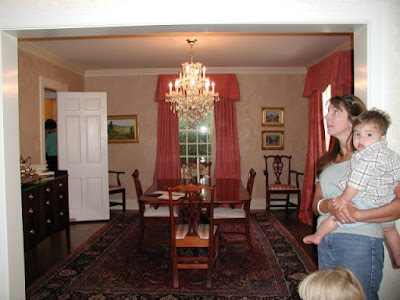 This is the room as it was decorated by the previous owners. It was very lovely and nicely done, but not my style. The drapes had lace under panels which completely covered the windows. I remember asking my sister to push them back when we took this photo. When she did I fell in love with the light that came flooding in. I did not care for the faux painting on the walls - the woodwork was also painted an antique white which did not match the rest of the house and looked dingy to me.
(Such an unflattering shot of me, let's all remember it is a "before" photo)
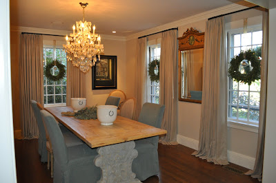 Here is the after. I loved the crystal chandelier and so it stayed. I repainted the walls and the trim, and used the same linen and hand forged rods as in the Living Room. Keeping the drapes, walls and trim colors uniform with the Living Room and Conservatory added a lightness to the entire first floor of this older historical Colonial.
 My old Dining Room had a pretty yellow painted table and slipcovered chairs with blue check skirts. Very country, very cutesy. They found a new home at the beach house. But, let's start at the beginning with before photos.
 (Such an unflattering shot of me, let's all remember it is a "before" photo)
Read about the Living Room here.  The table is from Belgium and has an old carved wood base with a distressed stripped wood top. The lighting in this photo is awful, but it shows a good close up of the table base which is over 4 inches thick and washed in a Gustavian gray. The chairs are the same as in the Breakfast Room but more slipcovered ones and less upholstered ones. Because most of the chairs are slipcovered it gives the room a much different feel - and now I have matching seating for 12.
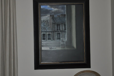 We also added some wonderful lighting to highlight our artwork. This painting, though not captured in this photo, has all the green/gray/blue tones of the chairs.
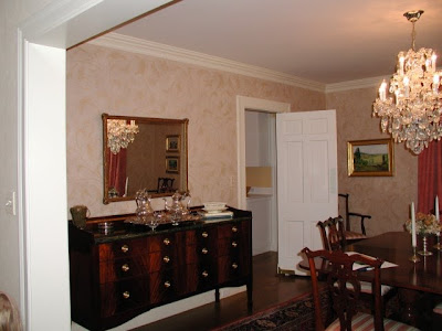 Here is the before from a different angle. That door leads into the Kitchen and the Butler's Pantry is directly to the right. You can spy a bit of the honed marble and gray cabinets of the Butler's Pantry when you sit at the table. You can read more about the Kitchen and Butler's Pantry here.
 Here is the after. The pine corner piece I bought many years ago in Bavaria and is Swedish. The spire is from Aidan Gray and the console from Wisteria - I like how the marble top echos the marble in the Butler's pantry. The small chair is one of two I found at a flea market in Bavaria almost 20 years ago.
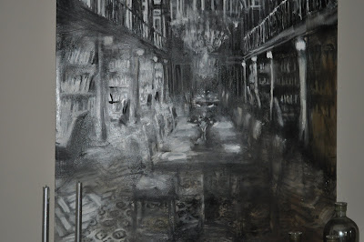 Here is a close up of the painting. I bought it in Denmark when I went to my sister's wedding. It still needs a frame, not sure where I am going with that - maybe silver, maybe gold, maybe "gilver", black or maybe no frame?? Thoughts??
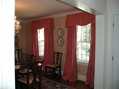 A before from another angle.
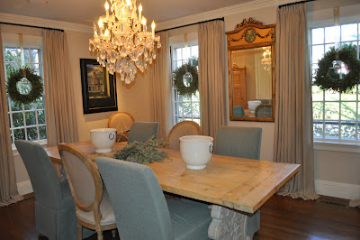 And the after. Clearly I need a rug. But I am torn, a sisal? an antique oriental? what about a needlepoint?? And I want to embellish the slipcovers, but with what?? Embroidery? Trims??Edging?? Thoughts???
Or maybe just keep it as is. Do I really want to spend money on room we almost never use???
What do you think??
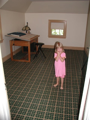 Here is another before photo - Can you guess what we are doing with this space??? I know you all love the rug and wonderful drab trim, but just wait a see how this will be transformed.
 The table is from Belgium and has an old carved wood base with a distressed stripped wood top. The lighting in this photo is awful, but it shows a good close up of the table base which is over 4 inches thick and washed in a Gustavian gray. The chairs are the same as in the Breakfast Room but more slipcovered ones and less upholstered ones. Because most of the chairs are slipcovered it gives the room a much different feel - and now I have matching seating for 12.
Or maybe just keep it as is. Do I really want to spend money on room we almost never use???
What do you think??
Stay tuned!!
Thursday, February 25, 2010
Antique China
Today is the 79th Tablescape Thursdays over at Between Naps on the Porch, so I thought I would share with a you a recent gathering I had where I used my antique Johnson Brothers green china.

You might remember that one of my goals of my Butler's Pantry renovation was to build some beautiful glass front cabinets to house these precious antiques. You can read all about the Butler's Pantry here.
But what good is China if you are only going to look at it behind glass? I decided to set it out for everyone to enjoy. You can see the antique soup tureen above.
I used Lemon Cypress trees as the centerpiece and pulled out my Apilco chocolate cups for individual arrangements at each place setting. I just put in a spring of greens and some berries.
You can see the bone dishes on the right - we used these as interesting bread plates.
And the covered dish held butter pats I made in pretty butter molds. I should have taken a photo of those!
I'll reveal the rest of the Dining Room on Monday but until then remember to enjoy your china and don't just keep it hidden behind glass.
Head on over to Tablescape Thursday to see more wonderful tables!!
Wednesday, February 24, 2010
About the Italian Chandelier!
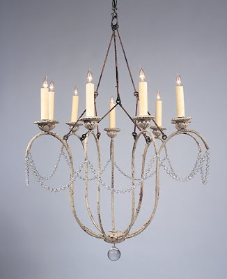
The chandelier is made by Niermann Weeks. It is called the Italian Chandelier and comes in both 9 arm and 12 arm sizes. The photo above shows what is considered the standard finish - a distressed, chippy white. My chandelier was custom finished in an antiqued silver - it has a beautiful depth of color. Niermann Weeks has many many different finishes to choose from.
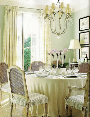 This photo from Things that Inspire via Anne Hepner gives you a very good shot of the piece. This example shows the fixture with shades, which I opted not to do. Here you see how nicely it looks in an informal room.
 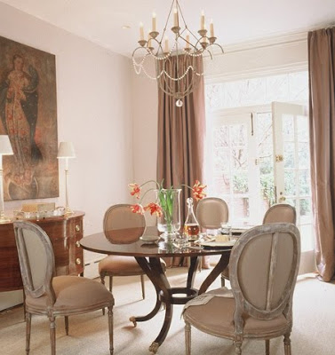 This photo from Things that Inspire via Caldwell Beebe gives you a clear picture of the crystals that surround the fixture. I like the sparkle the singular strand brings to the room. It add a interest but its not too fussy. This room is also lovely, though a bit more formal than my breakfast room, but notice the similarities in the chair style and curtain selection.
 I am sure you recognize this room from Better Homes and Gardens, which has been all over the blogs. Here you can see an example of the 12 arm style.
 Niermann Weeks writes about the Italian Chandelier on their website.
They first found antique sconces, which led to the design of the chandeliers. They mentioned that English designer Nina Campbell hangs the Italian chandelier in her own bedroom, and every time she’s moved, it’s moved with her. The photo above is not Nina Campbell's bedroom, but another gorgeous room from the talented Catalano Architects.
'
Holly at Things that Inspire did a wonderful, comprehensive post on the Joe Niermann and the Niermann Weeks company. To read more about it click Here
Holly at Things that Inspire did a wonderful, comprehensive post on the Joe Niermann and the Niermann Weeks company. To read more about it click Here
'
Thursday, February 18, 2010
My Breakfast Room and Family Room Reveal
When I bought my house I knew we would need to enlarge the kitchen and family room area. The previous owners were empty nesters and although the layout worked for them, it was not appropriate for our growing family.
This before picture was taken during our home inspection. At this point the previous owners had removed much of their family room furniture - all that remained was their small kitchen table and some odd chairs. You can see that the wall of windows was about 3 feet beyond the solid wall. A larger table would have ended up looming into the Family room space. So, when we were ready to renovate we pushed back the wall and added an additional nine feet to create a dedicated breakfast room. Here is the breakfast room after!
We recessed the ceiling and added beadboard and crown moulding to match the treatment we added in the kitchen.
I vacillated for months over the light fixture, but finally decided on the Niermann Weeks Italian Chandelier with an antiqued silvered finish. (Actually I vacillated over spending the money or not spending the money - I always knew it was just perfect) In the end, it was my husband's sage advice that made me order it - "You will look at this everyday, all day, for years - buy what you love!" I am so glad I listened to him (He says its one of the only times!)
I found a wonderful Belgian wrought iron table with old wood top that fit the space perfectly. Wisteria had a bench that was just the right size and I topped it with a grainsack! The linen curtains were a steal, only $20. a panel, a close-out from Country Curtains; all they needed was a little doctoring. 
You might remember that at this time I also took out the over head cabinets between the Family Room and Kitchen area and removed four lower cabinets to create more of a center island.
We added a gas fireplace, mantel and surrounded the area with crown moulding. We also placed a much larger TV above. Winter is long here so the fireplace makes the space so much more cozy.
From this...
(click to enlarge)
A final thought - I have received some email recently about rooms done by decorators that are considered "high-end" and not accessible to the average person. I just want to share with you that not all things that look expensive actually are expensive. Beauty does not have a price tag. Do not be afraid to mix $20 curtains and mantels you find in the trash with expensive chandeliers, or reproductions from mail order catalogs with real antiques. Trust what you love and it will all come together. It's not about the price, it's about surrounding yourself with things you enjoy.
We really enjoy our new space - I hope you do too!!
To see more of my house click here.
(all photos Willow Decor please do not copy without permission)
Subscribe to:
Posts (Atom)